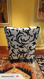
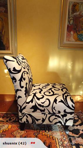
Structurally,
Rococo can be weak and illogical; however, even though the relationship between
the measurements may not be exact, its weakness hides within its visual
amusement. Varriano (1984) analysed rococo as an art of little concern for architectural
structure and the property of classical components, but when it came to the
care of organic shapes and decorative designs, it was generally astonishing.
To this way of analysing Rococo art, I can relate my chosen
object. Differently, the chair seems to have an exact structure. However, what seem
to be aesthetically pleasing to analyse in the object are the use of curves as
well as the pattern used for its decoration part, where you can easily notice
organic shapes being thrown all over the chair with no starting or ending points,
no structural aspects that can be related because of the decorative pattern nor
an easily identifiable linkage between the object and its appearance. It is
random, its pattern is illogical, but it is aesthetically pleasing to the eyes.
In the years of Rococo, one of the most effective ways for artists
to express their contained ideas and emotions was through paintings. Simply
because then, the use of colours was most likely unlimited. It was at this time
that the use of colours on painting was really explored. A said by
Jean-Baptiste Siméon Chardin: “Who told you that one paints with colours? One makes
use of colours, but one paints with emotions.” Meaning that anyone can use
colours, but it is the way it is used that gives it that unique effect. (Baur,
2001, p. 62)
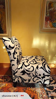
The way I refer my chair to the paragraph above is by
analysing its lack of colours, and thus, lack of emotions. Even though the
chair design is good and the decorative pattern is nice, by being black and
white the chair seems to be missing on something that could really add to its
effectiveness. Organic shapes in Rococo design were often followed by the
intense use of colour, however, the chair has shown to be nothing more than a
sample of simplified Rococo art.
Reference:
Varriano, J. (1984). Italian Baroque and Rococo Architecture. New York, United States: Oxford University Press.
Baur, Eva. (2001).
Rococo. Los Angeles, United States: TASCHEN.
TradeMe Link:

 I chose bold not only because it is more effective with expressions, but it also adds a lot to the intensity of the animation.


