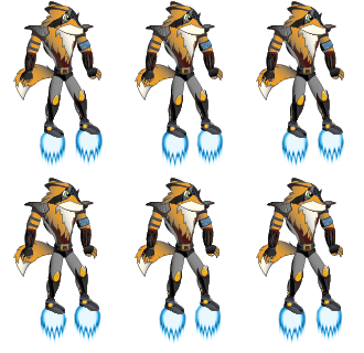
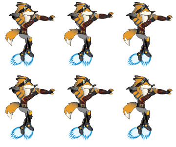
So after drawing the explosion I realised the there was a lot that I could improve on my character. I already had the technique down, it was just a matter of applying it to whatever I could.
The way I did it was, I had this blue sphere with an outside glow and I followed the explosion pattern, going from a dark outline to a strong white colour in the middle.
Then I used the warp tool to add motion aesthetic to the sphere.
I created several versions until I was happy with it
This is what it looked like in the end:
Here is the animation:
Then I did the same for the collision, used the same sphere, just a different pattern
Same deal with the collision of bullets between robots and character
Animation:
Then I figured: "Might as well change the glide as well and make it all consistent!
And so I did
Animations:


No comments:
Post a Comment